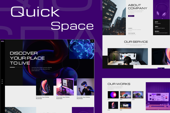
QuickSpace is the Creativ Design Elementor Template Kit, that perfectly fits for Designer, Business, Technology, and Modern website. QuickSpace’s clean & balanced layout make it best choice. The Kit includes a lot of templates that are easy to edit using Elementor page builder. Elementor Pro upgrade is required for post and theme builder features (not included) Kit Includes: Home 404 Contact Service Gallery Blog Single Categories Author Search This Template Kit demo uses CC0 images from Unsplash. How to Install: Install and Activate the “Envato Elements” plugin from Plugins > Add New in WordPress Do not unzip Go to Elements > Installed Kits and click the Upload Template Kit button. Before importing


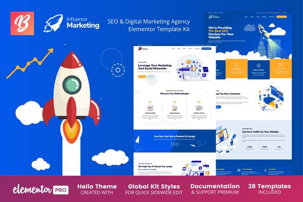
New version v.1.0.7 – September 2, 2021 Full Wordpress v.5.8 compatibility Full Elementor v.3.4.x & Elementor Pro v3.4.x plugin compatibility Full Envato Elements v.2.0.x plugin compatibility Influence Marketing is a perfect isometric template kit for you who are looking for a beautiful layout, bright colors and a really attractive look for your marketing project, digital agency, seo or other categories about technology and internet. It has 28 pre built layouts, header, footer, popup and several of the main scential pages that any complete kit should have: 404, price list and blog, besides other main pages like about us, services and contact. This kit requires the Elementor Pro upgrade for some templates and feature
5/ 3
146
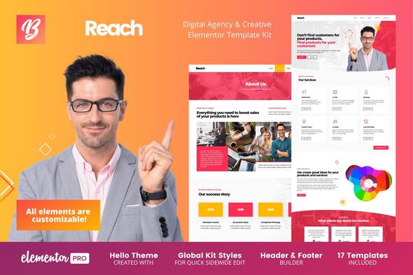
New version v.1.0.3 – September 2, 2021 Full Wordpress v.5.8 compatibility Full Elementor v.3.4.x & Elementor Pro v3.4.x plugin compatibility Full Envato Elements v.2.0.x plugin compatibility Reach is a modern and creative template for creative digital agencies and design. It has 17 pre-built templates with an excellent visual meticulously designed to be the best template in this segment. As its layout is fully adaptable, you can use this model for other types of businesses such as marketing agencies, business and many others. This kit was very well designed, allowing you to change the colors of the icons and elements on all pages. This kit requires the Elementor Pro upgrade for some templates and features (not included).
0/ 2
40
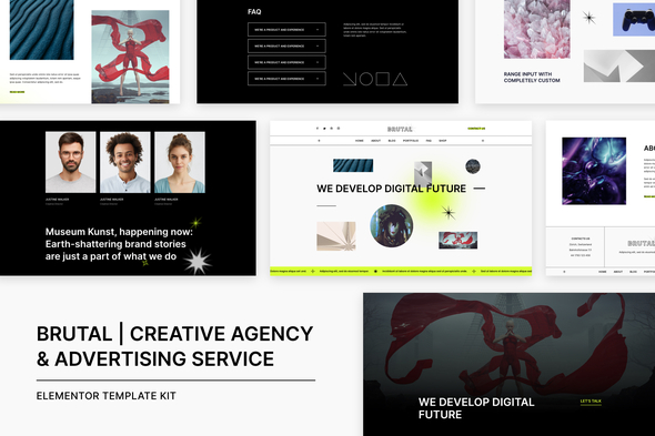
Brutal is a collection of stylish and modern pre-designed templates best suited for a contemporary web design studio or a creative agency, web designer’s portfolio, marketing bureau, and advertising firm, digital & graphic design, website building, etc. Creative Agency & Advertising Service Elementor Template Kit Features 15+ pre-made demos; Optimized for search engines; Ultra responsive layout; Retina ready; Fully customizable; Powerful & Lightweight; Cross Browser Compatibility: Firefox, Chrome, Safari, Opera **Required Plugins (included) ElementsKit Lite Extensions For Elementor JetWidgets For Elementor Qi Addons For Elementor WooCommerce Elementor Elementor Pro – This kit requires the Elementor Pro upgrad
0/ 1
1
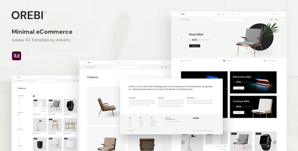
It is easy to use this design, you can adapt it for any kind of products. There are a lot of space for the information. This design is a great decision, if you want to create ecommerce market in the modern way. This Adobe XD template is perfect for a website project of Wordpress Woocommerce, Magento, Opencart, Prestashop, Silverstripe, and other systems Professional and creative design Full width 1920px Grid 1600px Vector icons Free Google fonts Components included Text styles included Easy & 100% customizable Adobe XD files All layer has been named and grouped properly Clean typography Clean user interface Pages Design contains 13 pages: Home Shop Product inside About Contacts Journal Journal inside Login Signup My account Cart
0/ 0
27