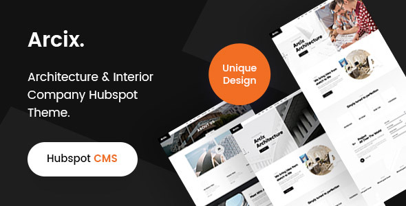
Arcix is a Hubspot theme for your architecture and Construction Business. It’s all device responsive You can’t afford to miss out on this incredible Hubspot Theme designed specifically for roofers and architecture companies! With Arcix, you’ll have everything you need in one place – including an easy way to showcase your work with beautiful galleries and portfolios. Arcix is a professional responsive HubSpot theme coded with Bootstrap framework. The template comes with a creative homepage design layouts, responsive and 40+ Modules . The design is very elegant and modern, and also very easy to customize with 1170px grid. We hope so you will feel happy with them. It is also suitable for Industrial sites, mechanical, engineering, chemi

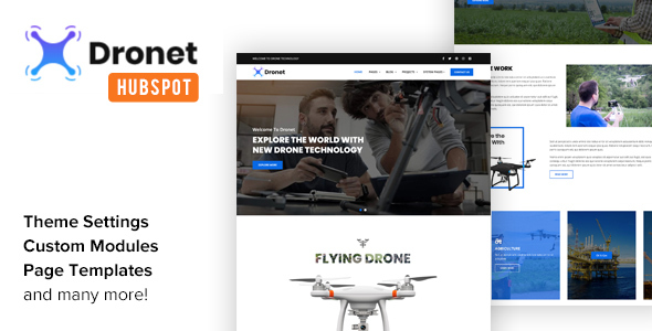
“Dronet” is a full functional HubSpot Theme designed & developed for Drone & UAV business websites and comes handy for corporate business websites as well. It is fully responsive theme for all screen sizes from the bigger ones to smartphones. Features Twitter Bootstrap Elements Retina Ready – Fully Responsive Grid / List views Isotope Galleries ($25 value) Font Awesome Web-Font Icons Multiple Sliders Google Fonts Support SEO Optimized Google Maps Touch/Swipe Support for Sliders Retina Ready & Fully Responsive Well Documented for Easy Editing Compatible With All Latest Browsers Prebuilt DND Templates Home About Pricing Contact Landing Page Template Left Sidebar Template Right Sidebar Blog Index Blog Index Grid Blog Post P
0/ 0
2
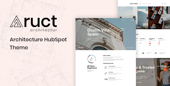
Suppose you want to make a statement about your architectural work or run an interior design business with some design styles to showcase on your website. In that case, you need those designs showcased beautifully on the site. Aruct is one of a kind HubSpot theme that will do just that for you. The clean and elegant layouts are perfect for showcasing both types of architecture we offer and enjoy displaying our latest projects in categories such as buildings or residential arts. Designed to best suit architecture studios, Auct’s Architecture HubSpot Theme comes with nine templates and 23 modules. All pages showcase a clean design with elegant, modern aesthetics. For example, the home page is full of rich colors and menus that are easy to
0/ 0
2
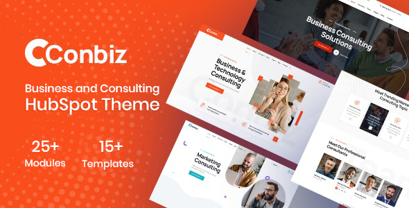
Conbiz – Consulting Business & Agency HubSpot Theme It is a clean, modern, and professional HubSpot Theme built for Consulting, Finance, Business, Corporate, Financial Advisors, Insurance Brokers, Accountants, Lawyers, Consultants, Agency, Accountant, Startup companies, Finance businesses, Consulting firms. It is clean, modern, and simple easy to customize. List of Modules: About Section About Section 2 Achievement Section Banner Section Blog Listings Blog Pagination Brand Section Contact Box Contact Form Section Footer Contact Footer Top Section Google Map Header Right Section Left Sidebar Widget 1 Member Details Top Part Menu Section Mobile Menu Bottom Contact N
0/ 0
0
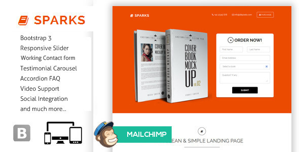
Iskry - idealna strona docelowa do zaprezentowania swojej książki temu światu. Możesz nawet użyć go jako strony docelowej aplikacji lub do pokazania swoich produktów. Jest uniwersalny. Ten szablon został zaprojektowany z Responsive design, Bootstrap, HTML5 / CSS3, Responsive slider, Testimonial Carolusel, Newsletter subskrybuj formularz i wiele więcej .. NOWE FUNKCJE 2 Różne układy Styl 1 - Płaska konstrukcja Styl 2 - Projekt Parallax Kontakt roboczy / formularz zamówienia Newsletter Mailchimp integracja AKTUALIZACJE 2014-03-14 - zintegruj obsługę mailchimp, dodany nowy styl [paralaksa], działający formularz kontaktowy i zaktualizowana dokumentacja 2014-03-01 - pierwsze wydanie CECHY Responsive design HTML5 / CSS3 Bootstrap 3 Płaska konstrukcja Responsive slider Mailchimp Newsletter Subskrypcja Tak
4.75/ 8
345
Funkcje motywu: Pełna kompatybilność z Joomla 1.6 i 1.7! Strona główna z suwakiem, oknem wiadomości, obszarem polecanych postów, postami według kategorii i kanałem Twittera Skrzynka wiadomości z przyciskiem Wybrany obszar postów z czterema opcjami układu: 2 przyklejone posty i kanał ostatnich wpisów, 3 przyklejone posty, 4 przyklejone posty, treść niestandardowa Kategoria zakładki z czterema ostatnimi postami na zakładkę Używa skryptu TimThumb do automatycznej zmiany rozmiaru obrazów w suwaku strony głównej Zastępowanie czcionek Cufon 23 czcionkami do wyboru z niestandardowymi opcjami koloru tła i dziewięcioma niestandardowymi wzorami tła 9 szablonów stron: Szablon domyślny Strona z listą blogów z dużymi polecanymi obrazami Blog wymienianie kolejno
1/ 3
25
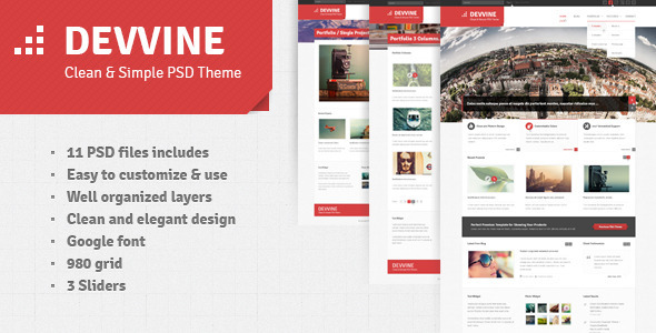
Devvine - czysty i Ceative Szablon PSD dobry dla Twojej firmy i stron kreatywnych. Zawiera 11 plików PSD. Funkcje: 11 plików PSD zawiera Łatwe do dostosowania i użytkowania Dobrze zorganizowane warstwy Czysta i elegancka czcionka Google 3 Slidery 980 grid Strony: Strona główna (3 Slidery) Blog Strona Blog Pojedyncza strona Portfolio Strona 3 Kolumna Portfolio Strona 4 Kolumna Portfolio Pojedyncza strona O nas Usługi Ceny Skróty tabletu Skontaktuj się z nami Kredyty: Ikony użyte w szablonie - http://www.iconsweets2.com/ http://glyphicons.com/ Niektóre obrazy w plikach podglądu to - http://www.flickr. com / photos / newelly /, http://www.flickr.com/photos/cubagallery/, http://www.flickr.com/photos/5y12u3k/ i nie są zawarte w pobieranych plikach
4.6/ 5
88