Web buttons with 3D effects. Made in pure css, it does not use any script.
0/ 0
9
Desciption Team Pro – A modern, responsive, team members showcase template part that is really professional, eye-catching and quickly editable. Features Unique Professional Design Layouts. Bootstrap 4 Supported. Custom CSS3 Animations. 100% Responsive and Mobile Ready. Slick, Light-weight and Super-fast. Clean, Eye-catching, and Professional Design. Cross Browsers Compatible. Pure HTML and CSS. Well Documentation. Library Bootstrap 4 Font Awesome 4.7.0 Abel – Google Font
0/ 0
0
These are High Tech Effects working on SVG and CSS3 to make your website more attractive and cool. High Tech style interactive effects launching on hover when a specific area of your website needs to be inlighted.
0/ 0
4
Features Modern Design Colorful Bootstrap Compatible Responsive (Bootstrap Layout)
0/ 0
4
Loader Animation / Preloader / Spinner in pure HTML&CSS Very easy to use Supports all latest browser versions Fully responsive No images, site loads faster Enjoy!
0/ 0
9
Desciption Responsive Tabs Pro – A modern, responsive, tabs collection that represent huge content in a narrow space. Users can easily navigate them. Features 4+ Unique Professional Design Layouts. 4+ Custom CSS3 Animations. 100% Responsive and Mobile Ready. Slick, Light-weight and Super-fast. Clean, Eye-catching, and Professional Design. Cross Browsers Compatible. Pure HTML, CSS and JS. RTL Supported. Well Documentation. Library Font Awesome 4.7.0 Abel – Google Font
0/ 0
1
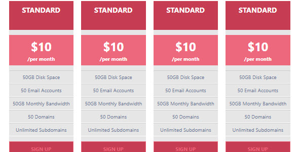
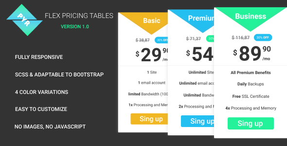
This is a responsive pricing table with clean, modern design FEATURE No javascript and images Adaptable to bootstrap 4 power of SASS easy to customize 4 colors variations
0/ 0
2
Desciption Pricing Table Pro – is a modern, eye-catching, responsive price comparison table. Its design is neat and clean, well-coded, easy customization and premium quality. Features Easy and Highly Customizable Responsive Layout Responsive Layout Clean, Eye-catching, Modern and Professional Design Clean, Eye-catching, Modern and Professional Design Well Documentation Library Font Awesome 4.7.0 Abel – Google Font
0/ 0
1
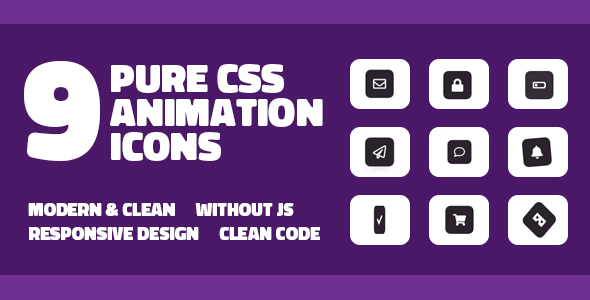
This set of 9 Icon and Button Animation Effects uses the new features of CSS3. Each effect is well separated and organized in the file. All animations are done in CSS3 and have no effect in JS. Easy customization and application.
0/ 0
1
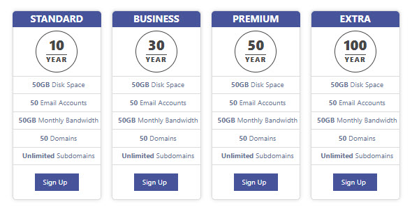
You can create a table of price lists and plans on your site quite easily You can also customize Assar Pricing | Responsive Modern Pricing Table Easily change to HTML 5, CSS3 codes If you need help, you can call me.
0/ 1
3
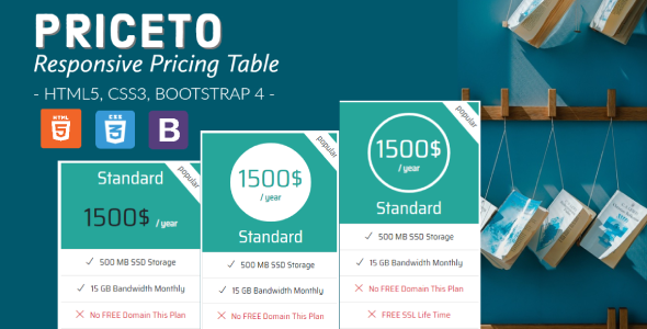
About Priceto Priceto pricing tables is a smart simple design to display your pricing plans to your site. A perfect design to show your pricing plan to your viewers. Coding style is very good and it’s 100% responsive, Mobile & cross browser capable. All you can to change to display your pricing table on your website in your desired location! HTML5 and CSS3 Take full advantage of modern web technologies. Semantic HTML markup and standards compliant CSS. Responsive Design A fully Bootstrap responsive layout that adapts perfectly for all device resolutions like mobiles, tablets and desktops. Cross-Browser Tested on Windows (Chrome, Firefox, Opera, IE8, IE9, IE10), Mac (Safari, Chrome, Firefox, Opera), iOS (iPhone, iPad) and Android suppo
0/ 0
0
Collection of page preloaders in pure HTML&CSS. Check the video preview to see the preloaders in motion. Real use case example included.
0/ 0
3
You can create a table of price lists and plans on your site quite easily You can also customize Assar Pricing | Responsive Modern Pricing Table Easily change to HTML 5, CSS3 codes If you need help, you can call me.
0/ 1
2
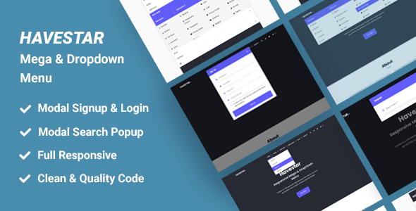
Havestar – Responsive Mega & Dropdown Menu is a fully responsive mega and dropdown menu that you can use in your portfolio, e-commerce, business, company and many designs.. Main Features: Based on Bootstrap 4.3.1 Built with SCSS HTML5 & CSS3 Valid HTML5 & CSS3 Full Responsive Easy Customize Search Bar Clean & Modern Design Mega Menu & Dropdown Cross Browser Support Well documented No Error ! Changelog 14 May 2020 * Dropdown Menu Error Resolved * Added Login, Search Bar, Signup Modal
0/ 0
43
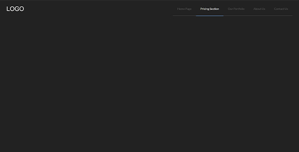
Create an Indicate Active Link program. Basically, there is a dummy text for LOGO and 5 navigation items or links. Below the navigation items, there is a light color line with the first item to last item placement. But the selected or active nav link has a blue underline, it helps to detect the currently active link. When you will click on another link then the blue underline will go and active that selected nav item. Also, the hover effect is similar, on hover the hovered item’s underline will blue and all other items will fade. You can use this program on your website otherwise, you can customize it to creating better.
0/ 0
1
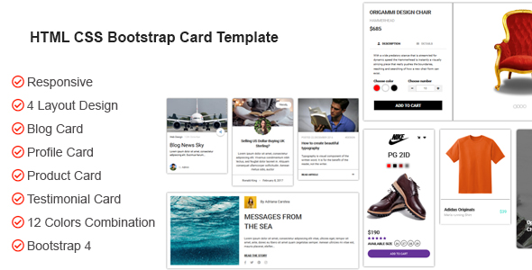
A card is a flexible and extensible content container. It includes options for a wide variety of content, contextual background colors. Bootstrap cards component provide a flexible and extensible container for displaying content. It’s built 4 different styles and 12 colors combination. Includes Blog Card, Profile Card, Product Card, Testimonial Card. Simple and easy customizable, it’s made with Bootstrap responsive design and some awesome animations. If you have any questions don’t hesitate to contact me. Version: 1.0 – Last updated: 2020, Feb 08 Browsers: IE8, IE9, IE10, IE11, Firefox, Safari, Opera, Chrome
0/ 1
9
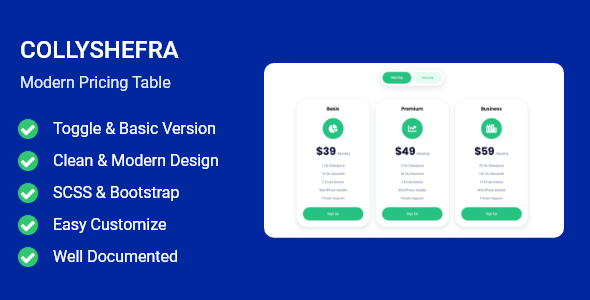
Determine the pricing section of your website. Collyshefra can be easily customized and fully responsive. Main Features Based on Bootstrap 4.3.1 Built with SCSS HTML5 & CSS3 Valid HTML5 & CSS3 Full Responsive Easy Customize Clean & Modern Design Cross Browser Support Well documented
0/ 1
21
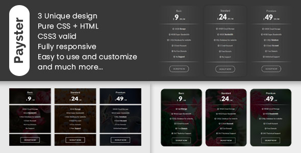
Payster – Ultimate pricing tables is an unique and advance responsive design based on bootstrap v4.4.1. It is built using HTML5 and CSS3 with modern design. You can easily integrate and customize it in your website. It has 3 type of unique design variation. Features: Bootstrap version 4 Responsive Design W3c validate markup Unique , clean and modern design Easy to customize Hover effects Three column pricing plans Three variant design Well documented 24/7 Friendly customer support And much more… Reasource Credits: Bootstrap 4.4.1 Google fonts Font awesome icons Support Feel free to contact us any time. We have a dedicated team to provide you the best support.
0/ 0
3
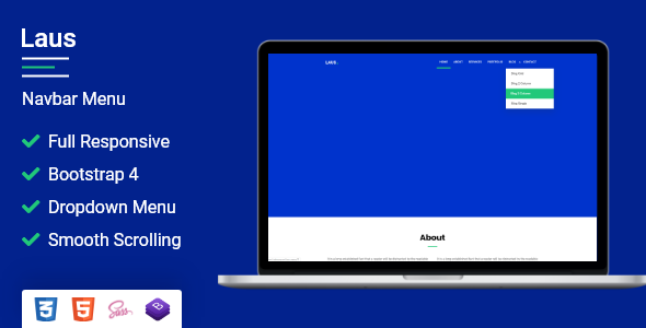
Laus – Dropdown & Hamburger Menu is modern, flexible, easy to use and customize. The portfolio can be easily integrated into your projects for your one page and many other designs. Based on Bootstrap 4.3.1 Built with SCSS HTML5 & CSS3 Valid HTML5 & CSS3 Full Responsive Easy Customize Login & Sign Up Form Popup Clean & Modern Design Smooth Scroll Cross Browser Support Well documented No Error !
0/ 1
18
Basically, there is a button you will see at first. When you will click on it a box will appear with full-screen size, the box contains the nav. The nav has a sidebar a top bar, a blank field with a search box. In the sidebar, there are nav items or links and each item has its own image, when you click on any item the image will change on the left blank field. At the top bar, there is a text for showing the menu and a close button to close the popup box. This program is also responsive, in small screen size the sidebar will shift to the top and you have to scroll to see all items. The modal box nav can be a good practice of those peoples whos step in web design and development. You can use this modal full-screen nav on your website, afte
0/ 0
3


